
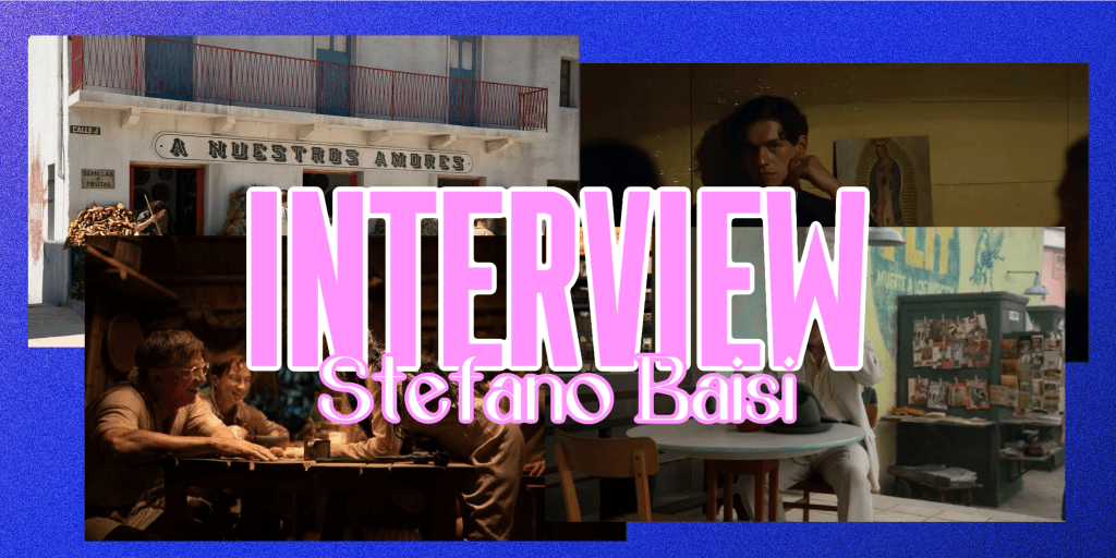
A story of unsynchronized love set in 1950s Mexico as expat Lee takes a sudden interest in another American expat who will never love him in the way he’s longing for. Luca Guadagnino enters another level of intimacy in Queer through a textured dream-line trance led by his protagonist’s emotions. Offscreen Central has the opportunity to speak with production designer Stefano Baisi about creating a fictional world blending historical accuracy, using bright colors to contrast with darker tones of other films, and using symmetry and illusions for the emotional impact of the sets.
Jillian Chilingerian: A lot of what I loved had to do with the production design so I am excited to get into a lot of it because I love how the environment here speaks to the psyche of Lee and brings you into a world that you can’t even describe. It feels so like otherworldly and like you’re in a dream or purgatory. Let’s start with initially, coming on with Luca and discussing what his vision was with the vision of how things are in the book, and creating its voice cinematically.
Stefano Baisi: First of all, I’d like to say that Luca asked me to do the design of the movie, but I’m not in the movie business. I was not in the movie business at the time, so we worked together for six years before doing Queer, and at some point, he asked me that. I trusted him a lot so I immediately accepted and I read the book before because he gave me the book the month before I immediately. I did the same trip that Burroughs did in the 50s, but the opposite path. I started with the researcher Ben Panzeca from Ecuador to Panama City then Mexico City and visited the real places mentioned in the book and that were in the script, of course. So I was able to understand the places, despite being 70 years later. I think that was very important for me, because I understood the texture, and I understood the proportion between the buildings. I understood the jungle, etc. And what is Ecuador? What is Panama City? I’ve never been there before.
In the first part of the job, I spoke with Luca a lot about understanding what he wanted to do, and he wanted to create a dream-like scenario because the book is a dream-like scenario, so we don’t want it to replicate reality perfectly. We did a lot of historical research with Ben, the researcher, and we analyzed everything. The style of architecture, and buildings, and what was Mexico City at the time? How were the places that are described in the book at the time, but we wanted to give the movie, the texture of something that is not real?
Jillian Chilingerian: I was watching it and I was like, I want to say it feels artificial, and then like knowing that that is the context of it. It’s just so well done because you feel like you’re on the set, but it puts you into, how Lee’s state of mind is, of how you read it, he’s escaped the confines of, like, traditional life, and he gets to be his authentic self in this world, but he’s still haunted by his past and seeing how he operates in. When you’re balancing that historical aspect with that, dream-like sense. The architecture and design speak to the amount of people that were coming to Mexico City at that time to escape, and how that influenced a lot of the structures.
Stefano Baisi: Of course, we wanted to get to the look of the movie, sort of, as you are on a lethargic trip. So the choosing of the colors was based on this. We choose to use acidic colors, for example, or bright colors, instead of using brownish or darker colors, as you can see in Naked Lunch for example, Cronenberg, and it’s because it’s a love story, We wanted to avoid this kind of look. Regarding the style, we choose to highlight some real landmarks of Mexico City in the 50s, maybe close, very close, to the neighborhood that they are describing in the book that is in the Heart of Roman Orte, or perhaps the neighbor, lower class. We chose to put here and there, some landmarks, recognizable like an old cinema, but everything else is completely designed from scratch, starting from the historical research. We understood that at the time, there was a mixture of modernism and the colonial style in architecture. We put everything together, and we created this fictional Mexico City that doesn’t exist.
Jillian Chilingerian: It looks so nice with just how it feels like there’s been a history there, but then there’s also just so much that is conflicting that like also works so well together, given, like, the context of the story. And it’s just really interesting to see
Stefano Baisi: Everything is designed related to the emotions and the feelings of the characters. For example, in Lee’s apartment, you can see that the differently than other other set. There is this red carpet on the floor, yeah, the red and the warm color are related to the desire, to the longing. You can see the skies. The skies are all painted by concept artists and there is this scene where they are on Lee’s couch, and you can see this purple, reddish sky. In that case, the color is related to the emotion.
Jillian Chilingerian: I love the scene where he’s walking, and then the flowers from the trees come down very juxtaposes how he’s feeling. He’s going through love. But Is it love? Is it obsession? Is it unhealthy? It’s interesting to see what colors appear, as you mentioned, during this emotional state.
Stefano Baisi: Yeah, that was Luca’s request because he loves the Jacaranda trees that you can see often in South America. For him, blue is the color of loneliness. So that is why we chose Jacaranda, but also because in Mexico, there are a lot of Jacaranda, and you can see.
Jillian Chilingerian: One of my favorite scenes, so many favorite scenes, but when they’re in the theater together, and the cameras coming down, changing the dimensions, I’m really curious about building that miniature.
Stefano Baisi: We used a lot of miniatures in the movie. I’m a little sad because there is a longer dream sequence that was cut in the final cut with all these miniatures. I hope that at some point that will be released an extended version with this sequence, but in most cases, the miniature is the miniature. In this case, the miniature deals with the real set. So we studied during the concept phase and the design phase, how to create this illusion. We thought that blocking with the values trade the first aerial, as if is a theater gallery. You can add the rest, creating a full perspective, and we studied this camera movement with the 3D software. We simulated in advance the camera movement to understand how it could work and then we built it with the special support of Simon Weiss. That is this great master of the miniature master that they usually work, as Wes Anderson,
Jillian Chilingerian: That scene says so much about their relationship and the camera goes into the force perspective. We were talking a lot about, like, how the emotion feeds into the environment. With Lee, he’s very isolated. He’s yearning for this connection with this other man who will never love him in the way that he wants to love him. We see that a lot with symmetry within the design of the sets, as well as just like reflection, where you think about how other people perceive you. In a lot of the sets and places we go, there is such a symmetry and communicating this idea of connection versus isolation.
Stefano Baisi: Yes, thank you for the question. I think Luca has taught me a lot in these years. You can feel the things, despite maybe they are out of focus, or maybe you cannot, because it’s the unconscious that works for you. So every set is designed thinking about the character’s personality or personalities or what the scene is. So often we thought about the set as if they were characters themselves and because there is a mirroring between the two characters, we thought that the symmetry was an interesting concept, together with the mirrors together with the double and, for example, this apartment’s plan is a rectangle that intersects another rectangle. It is completely symmetric. You have the counter in the middle and the two wings are the same. Ships Ahoy and Lola’s bar is completely symmetric. So we tried to give this concept to the to the to the movie.
Jillian Chilingerian: Thank you so much for this time. Seeing that this was, like, your first step into production design for a film, I was like, completely blown away, because everything is so textured, the atmosphere. I think when you read this book, it’s so easy to, visualize how these places look like, and just seeing how Luca and you translated them into the film was so beautiful.
Stefano Baisi: Thank you very much.
Queer is now playing in select theaters.
You can read our review of the film here.

Leave a comment