
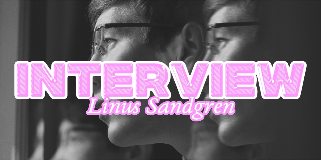
Lots of people get lost in Saltburn. It’s a statement that permeates throughout Emerald Fennell’s sophomore film and always stays with the audience as the story dives deeper into the darker, violent undertones of the grand estate itself. It’s no surprise that Saltburn sucks you into a vortex of old art, 2000s fashion, and of course, sequences that will have the audience talking. A part of the reason why Saltburn has stayed in our minds is without a doubt, the cinematography of this world and how it’s presented. With an aspect ratio of 1:33:1 and shot on 35mm Kodak film, Saltburn feels like stepping into a portrait of decadence and masculinity. Staff writer Leia Mendoza spoke to Saltburn’s Director of Photography Linus Sandgren about his work on Saltburn, the use of art as inspiration, and Oliver as a character.
Leia Mendoza: Hi Linus! I’m so excited to talk to you about Saltburn and everything about it. I feel like I’ve grown up watching your work so as soon as I found out that you were going to be DP on Saltburn, I was like “Oh my gosh, I have to see this,” so I’m so excited to be able to talk to you about Saltburn!
Linus Sandgren: Thank you, that’s wonderful!
Leia Mendoza: I kind of wanted to start off with the fact that most of Saltburn takes place at the actual estate, but I actually wanted to talk about the Oxford scenes first. Because Oxford is an older, esteemed university that primarily uses natural lighting and large windows. There’s candles when Oliver meets Michael, and also Saltburn itself as an estate is very natural lighting. What was the hardest part in the technical aspect about shooting the scenes at Oxford, versus the hardest part of shooting at Saltburn itself?
Linus Sandgren: That’s a good observation! I feel like when you want to create visuals for a film, I feel like you want to base it on the script but also the themes of the script sort of changes slightly from being about a lonely kid in college that is an outsider and turns into, maybe it’s some sort of sexual journey between some people or something is going on. You have this sort of dark reality of what is actually behind everything. Those different themes feel very good if you try not to go too far away from the themes visually because then you feel like you’re watching another film recently. Sometimes that happens when you’re not in agreement with the audience on what we’re watching, if you want to play with genres or play to think that this film is going one way when it’s actually going another way. It’s good to keep it together a little bit. With that being said, it’s true that where they’re going later in the film is in the summer and it’s meant to be the best summer ever kind of feel to it. With the outside of the house, and at the same time, the inside of the house is keeping a lot of secrets and it felt like something was keeping dark secrets. Even though its natural light coming through, it would be not illuminated very much certain times. In the TV room, it’s a little bit more light, but otherwise, it’s kind of that thing where you expose more light coming in but not with the shadows inside. And so, it definitely had to be natural but it was definitely inspired by paintings, like Barrack paintings. It’s still dark in the shadows, but it’s not really illuminated much. But, I feel like part of it was to try to depict the family’s estate in the same way like how they’ve always been depicted similar to how they’ve been depicted hundreds of years in the paintings. It’s the naturalistic light coming though but with contrast. For the candle lit scene, where it was that the light came from the fire and there were no other lights in there. It was dark around, but that negative space was something they used in the Renaissance and Barrack era. That creates compositions that are interesting and hopefully makes you want to keep watching. You can use that with what’s going on in the film, and if you have that kind of composition that is evocative and interesting, and then you see something nasty, it’s hard because you want to keep watching but you also don’t want to keep watching. It’s that provocative situation that we were after. When it comes to Oxford, it had to do more with making Oliver look more isolated from the group and at the same time, this is a fancy college. We found a location that we thought was interesting for the look of it, and looked old school. The library we thought was beautiful and had old books, but still in the same way, we considered and had a lot of motif that we wanted to isolate him. Oliver is inside his dorm and looks out to Felix outside through these bars like he’s in prison. He’s at the pool table playing and looks out through the bars at the group of people that are partying. He’s constantly isolated between people that way. We wanted to maintain a moody feel to it. It’s nice to indicate that there’s something lurking boiling, and that there’s something suspenseful coming. When we come to Saltburn, it’s like this fly catcher hanging and it’s moody, and now you think, “I know what this is, the house is haunted!” or something is problematic with the house. We thought of that thematically, while the outdoors were very sexy and hot. In Oxford, I think we kind of get to know that Oliver is creepy by watching Felix with a girl in the dorm. It plants something into your head that something is wrong with this guy. We always needed to consider how Oliver was portrayed. There’s so many different things, but I always tried to think of the different themes to be somewhat combinable to each other. That’s what we tried there between the locations.
Leia Mendoza: I’m really happy you talked about Saltburn’s art! I feel like we as the audience are essentially like Oliver, it feels like everything we see on screen is something out of a painting that the Cattons would own in the house. I noticed that with the aspect ratio and even how the art is framed and presented, even though Saltburn as an estate is so grand and beautiful, it always feels like you’re being constantly watched and monitored. Even though it’s an empty estate for the most time, it tonally makes the story feel more haunted. How much of the actual art in the estate helped with framing and the camerawork?
Linus Sandgren: Oh, totally! A lot of it was inspiring because for example, on the exterior when we shot Elspeth and Oliver’s scene where she’s drinking her drink and they’re having a chat in the dusk, that statue, I’m not sure if you thought of it but there’s a statue they’re standing by where a man is hammering another guy. It’s a really brutal scene in this big stone statue. You’re like, “This is a normal family manor, right?” and this is a normal family that lives here, why would they have a statue of someone killing a guy? It’s just amazing on how you find these kind of statues in these kind of places that are quite brutal and interesting. Inside, the staircase itself where we see Elspeth walk and it’s a round one, that one is very unique. Hardly of any of those types of staircases exist anymore, and it was really unique on how that staircase was built. It was a piece of art itself and it was very important for us. Part of what we loved in the house was that we loved the staircase because it was so interesting. It was nice that with the aspect ratio, it was just one big circle, like a spiral. In the other staircase that we shot in red light, there’s a lot of that art that you look very straight into the ceiling and you see an oil painting of angels. In the big rooms, there’s art of different kings. A lot of it informed us about how those paintings were composed. For us, like you said, the idea was to think about how we could best portray this family with painterly images that is more painterly than cinematic. We thought more of the painterly composition than the traditional cinematic composition. I feel like I talked to someone before about this that the scope of a film is that generally, if you go widescreen, you see more of the place. But in this case, somehow, it served two things with the more square format. You actually see more of the house in a way where you see the ceiling, and you wouldn’t have seen that in a wider format. You instead see the ceiling often and the house becomes more revenant because a group shot of five people has a lot of headroom and you see more of the estate while if you compose the five people on a widescreen, you would see more of them and less of the house. So, somehow, at the same time, when you cut into someone, it’s very singular and claustrophobic and it feels like only one person when you see them instead of the other surroundings. There were multiple reasons behind this, and they all just sort of aligned for us.
Leia Mendoza: Thank you so much! I loved being able to talk to you about Saltburn. I’m actually getting ready to take a cinematography class right now, so this was so great! Thank you for taking the time to do this interview and congratulations on Saltburn! I can’t wait to see what’s next in your filmography.
Linus Sandgren: Thank you! Have a great day!
Saltburn is currently in theaters and will be streaming on Amazon Prime on December 22, 2023.
You can read our review of Saltburn here.

Leave a comment